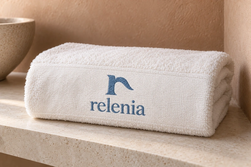
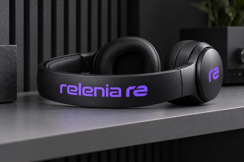
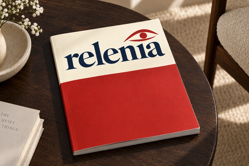
Relenia has a gentle, measured character that suits businesses built around care, discernment or making complex experiences easier to navigate. Its flowing sound and repeated vowels suggest an approachable identity, while the seven-letter form gives it enough presence for packaging, a publication masthead or a digital product. It feels closer to a personal name than a functional label, which can help establish a human tone.
That character could serve a small hospitality group, a personal care range, a curated retailer or a design-led software service. Each would need a clear descriptor and a specific point of view: Relenia does not explain an offering on its own. Its softness is also a positioning choice, better suited to thoughtful service and considered design than to rugged equipment or overtly aggressive performance branding.
Name analysis
Relenia has an alternating consonant-vowel structure through its first six letters, followed by a final a. The r, l and n give it a relatively smooth consonant sequence, while the repeated e creates a visible internal pattern. Plausible English readings include reh-LEE-nee-uh and reh-LEN-ee-uh; some speakers may compress the ending into fewer syllables. That uncertainty keeps pronounceability below the exceptional range and could affect spelling after a spoken introduction. The -enia ending may suggest a personal name or a coined institutional name to some readers, but neither is an established meaning here. No etymology or cross-language interpretation has been verified. At seven letters, Relenia is compact on the page, though its spoken form is less brief.
Assessment summary
Relenia is a credible choice for a composed, approachable brand with room to define its own subject matter. Its strengths are fluid sound and a balanced written form, rather than immediate meaning or exceptional distinctiveness. It would benefit from a clear descriptor and consistent spoken use.